Refactoring MikeAparicio.com
May 26, 2022
It's been about two years since I last rebuilt my blog. Since that time I've learned a lot more about Eleventy and my thinking around design systems and CSS has evolved a bit.
My existing codebase had accumulated numerous failed attempts at implementing search, adding a CMS, not to mention all of the abandoned drafts. The features I was able to cobble together were hastily and shamelessly borrowed from various Eleventy starters. It got to the point where the code was causing me anxiety any time I'd sit down to try and write a post. Something had to give!

I decided to start completely from scratch with a fresh build of the most bleeding edge version of Eleventy (currently 2.0.0-canary.11). Here's a few things I learned along the way.
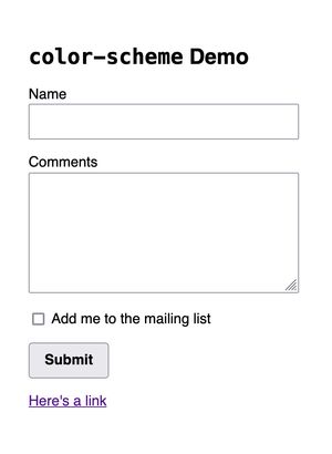
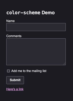
Setting a color scheme
For this design refresh I wanted to default to a dark design. (Light mode to come!) You may be aware of the CSS media query prefers-color-scheme, but there is also a CSS property called color-scheme that provides some default styles based on its setting.


color-scheme provides default styles appropriate to the author's preferred color scheme, or can be overridden by the user's.
You can set this in your CSS to indicate that the site supports both dark and light schemes and whichever is first is the author's preferred default.
:root {
  color-scheme: dark light;
}
You can also set this in a meta tag in the head to help the browser choose the correct color scheme before the CSS is loaded.
<meta name="color-scheme" content="dark light">Adding a non-fluid responsive type scale
While CSS's clamp function is useful for creating fluid type/spacing scales (e.g. Utopia), I haven't quite embraced it yet. Still, I did want to have a larger type scale and gutter size on large screens than on smaller ones, so I decided to try combining Sass variables, which I use for my design tokens, and CSS custom properties.
First, in my global tokens I set my type scale as follows:
$font-size-100: .75rem;
$font-size-200: .875rem;
$font-size-300: 1rem;
$font-size-400: 1.25rem;
$font-size-500: 1.5rem;
$font-size-600: 2rem;
$font-size-700: 2.5rem;
$font-size-800: 3rem;
Then I set some CSS custom properties for font size and shift the entire scale and double the gutter size on large screens with a media query:
:where(html) {
  --font-size-200: #{$font-size-100};
  --font-size-300: #{$font-size-200};
  --font-size-400: #{$font-size-300};
  --font-size-500: #{$font-size-400};
  --font-size-600: #{$font-size-500};
  --font-size-700: #{$font-size-600};
  --font-size-800: #{$font-size-700};
  --gutter: #{$size-gutter};

  @media(min-width: $breakpoint-medium) {
    --font-size-200: #{$font-size-200};
    --font-size-300: #{$font-size-300};
    --font-size-400: #{$font-size-400};
    --font-size-500: #{$font-size-500};
    --font-size-600: #{$font-size-600};
    --font-size-700: #{$font-size-700};
    --font-size-800: #{$font-size-800};
    --gutter: calc(#{$size-gutter} * 2);
  }
}
Then in my component tokens, instead of referencing a Sass variable, I reference the CSS custom property:
$heading-1-font-size: var(--font-size-800);
$heading-2-font-size: var(--font-size-700);
$heading-3-font-size: var(--font-size-600);
$heading-4-font-size: var(--font-size-500);

$text-large-font-size: var(--font-size-400);
$text-medium-font-size: var(--font-size-300);
$text-small-font-size: var(--font-size-200);
Is this overkill? Should I just give in and use clamp? Maybe! But for now this does the job.
Dealing with drafts
Previously, my drafts just consisted of some Markdown files and I didn't really have a way to preview them without moving them to the posts folder. I came across a few different solutions for handling drafts, but most of them involved using environment variables and/or adding a bunch of code to my .eleventy.js file.
Instead, I ended up creating a drafts folder and including a data file (drafts.json) that set the bare minimum of front matter for all drafts:
{
  "layout" : "post",
  "thumbnail": "wtf-tailwind.jpg",
  "thumbnailAlt": "..."
}
In .eleventy.js I created a collection based on all Markdown files in the drafts folder:
  eleventyConfig.addCollection('drafts', collection => {
    return [
      ...collection.getFilteredByGlob('./_src/drafts/*.md')
    ].reverse();
  });
Then I made an index page that lists all of my drafts as well as a list of ideas that pulls from a data file (_data/ideas.json):
---
title: Drafts
layout: page
eleventyExcludeFromCollections: true
---

{% for post in collections.drafts %}
* [{{ post.data.title }}]({{ post.url }})
{% endfor %}

## Ideas

{% for idea in ideas %}
* {{ idea }}
{% endfor %}
Finally, I made sure to add the drafts folder (and ideas list!) to my .gitignore to avoid committing drafts to my repo, which would also deploy them to the live site.
Displaying a list of tags
On the previous site, you could click on tags within a post to see all posts with that tag, but there wasn't a way to see all of the tags. Some research turned up a few different ways to achieve this, but they all felt overly complicated.
The solution I landed on was pretty succinct and did exactly what I needed it to do:
<ul class="ma-tag-list" role="list">
  {% for tag, posts in collections | dictsort %}
    {% if tag != "all" and tag != "posts" and tag != "drafts" %}
      <li><a href="/tag/{{ tag | slugify }}" class="ma-tag">
        {{ tag }} ({{ posts.length }})
      </a></li>
    {% endif %}
  {% endfor %}
</ul>
The Nunjucks dictsort filter sorts the tags alphabetically. I exclude specific collections in the if block. Finally, I display a link to the tag page that shows all posts with that tag, as well as a count of how many posts include that tag.
Having a list of all the tags helped surface how many tags were only used once, and I ended up stripping most of those out of the individual posts. (Things like specific video game or movie titles, which I'm unlikely to write another post on.)
You can see this tag list on top of the Blog page.
Including a partial with an async shortcode
For posts I have a card pattern that I use on both the homepage as well as the blog page. In order to not repeat the pattern, I put it in an include. But when I did that, the entire card didn't render and Eleventy didn't throw an error.
I came to found out that if you use a custom shortcode that has an asynchronous function in it, Eleventy tries to build the page before the function can finish and nothing appears.
The solution is rather than using a for loop, you can use Nunjucks' asyncEach instead:
{% asyncEach post in collections[tag] | reverse %}
  {% include "partials/card.njk" %}
{% endeach %}
However, if you try and nest a loop inside of that (if loop.index0 <= 2), it still won't render the include. To show the last three posts on the homepage, I ended up using slice():
{% asyncEach post in collections.posts.slice(0, 3) %}
  {% include "partials/card.njk" %}
{% endeach %}
Problem solved!
Use as little HTML as possible
One of my biggest regrets was that I used entirely too much HTML in my posts because I wanted to have more control over styling without having to style elements like h2 directly. This made it really challenging to redesign based on these classes and it was a lot of extra friction in writing new posts.
Instead I decided to lean heavily on Markdown and apply styles to elements within the article element on post pages. The only HTML I ended up keeping were figure elements (as there wasn't a great way to deal with these without a Markdown extension) and third-party embeds like Twitter tweets.
Stripping out all of the HTML from each post and restyling everything proved to be one of the most time-consuming parts of this refactor. But it did give me an opportunity to proofread all of my previous posts and check for typos.
I had seen an article on using Design Mode in Eleventy, which was a feature I didn't even know was a thing. It basically makes a whole page behave as if contenteditable were enabled.
Rather than following the article and building design mode into Eleventy, I decided to make a good old-fashioned bookmarklet. To try this yourself, make a new bookmark in your browser of choice and set the following as the link:
javascript: document.designMode="on";void 0;This lets you turn on design mode on any webpage by clicking on the bookmark. Design mode will highlight any typos with a little red squiggle.
I could have probably used a spellcheck extension in VSCode, but this was a fun alternative.
Adding more meaningful copy
I wanted to tighten up the copy on my homepage and try and give a better sense of what I do. I'm tired of getting recruiters reaching out with opportunities to do feature work, building React components, or other stuff I'm not interested in. Not that recruiters usually bother to read too deeply into someone's background. (If you're a recruiter and you've read this far, here's a cookie: 🍪)
My previous site intro read:
Hi! I'm Mike Aparicio, a Chicago-based web developer interested in helping companies large and small improve collaboration between design and engineering through the use of design systems.
Which I trimmed down to:
Improving collaboration between design and engineering with the power of design systems
Which is still pretty vague but more concise. There's no longer a need to introduce myself since I changed from a logo to my name in the header, and my location is mostly irrelevant now, thanks to Covid.
I also fleshed out my brief work experience section that highlights my superpower: creating custom CSS frameworks that empower engineering teams to get from concept to production quickly, while writing little to no CSS.
I also added a section about my weekly stream and added a contact form so that people can more easily get in touch.
Stretch goals
Aside from cleaning up the codebase and refreshing the design a bit, my goal for launch was to reach parity feature- and content-wise with the existing site.
Anything beyond that I listed as stretch goals. Some of those goals include:
Adding a design system page. I want to better outline my approach to design systems and also demonstrate some concepts by documenting the system in use on this site. It's kind of tricky to show design system work in a portfolio because typically you're not designing the visual style of the system (if you're an engineer) and you're not responsible for building the end features. Being able to show a design system in full without having to worry about exposing proprietary company code should be useful!
Adding search. I don't know if there's much demand for this but I was able to do it pretty easily on the documentation site for Provi's design system so I might as well add it here, too.
Automate Open Graph images. I've seen a few articles on this and I think I might dig into them a little deeper. Right now I usually just include an image from the post for the social image but it isn't always cropped to the right aspect ratio. I'd love to be able to automate it so that I can continue using any size image and have my build generate the appropriate social images for me.
Add light mode. It was so weird toggling between the existing site and this redesign. I have gone full dark mode wherever I can, and looking back at the old site burns my retinas now. I realize some people prefer light mode, so I want to give folks that option. I just want to make sure I take the time to do it well and not just invert some colors.
Add more about my previous work. When I last redid the site I was transitioning from working at Groupon for almost nine years to a new startup at Provi. I didn't have much work to demonstrate at my new gig. But almost two years have passed, so I think I have a lot more to say. I was at Groupon for so long that I don't think the work I did previously was worth highlighting, but at the same time I kind of feel nostalgic about my days of building lots of custom web apps with PHP and MySQL. I also want to showcase more of the old side projects I've been digging up recently.
Wrapping up
So that's the new site. I'd love to hear your feedback. I'll continue to iterate on it but the most important thing to me is that the codebase is a little leaner and causes me less anxiety when thinking about writing a new post.
